
Share This Article
Webinar Landing Page

What They Did Well:
The word "FREE" adds persuasiveness to this webinar post-click landing page.
The headline "How To" clearly conveys the benefit.
Video takes advantage of our preference for visual content.
CTAs working together in order to share prospects
8 Example of Converting High Converting Landing Pages for Webinars
The perfect time to host a webinar is right now.
These tools are cost-effective, easy, and a vital part of nurturing leads.
Your webinar promotion is best done with high-converting, well-designed landing pages.
How can you get started?
Learn what webinar page elements are high-converting, and how you can create landing pages that convert.
What components does a webinar landing page require?
High converting webinar landing pages are:
Very useful
It is accessible
Visual
Compelling
Sensible use of time
Your webinar benefits can be easily found by users and they can sign up for it with no hassle. This information is also made easy with visuals.

1. One Title That Converts
The title of your landing page should be direct – adding "fluff" to your title will only distract your users.
The title of your webinar should explain to users the purpose and benefits it offers.
The benefit is not included in the offer, so they will likely skip it.
5. Appealing visuals
Visuals bring your landing page to life. Your brand can be represented through visuals.
Add a professional headshot that shows you and the webinar host. The headshot should be friendly and easy to approach.
Photos of guest speakers are also welcome.
The visuals can be as simple as using brand colors. It's great to have designs, so long as they aren't too distracting.
Recording your webinar
Because it clashes with their work schedule or they forget, the majority of your attendees won't show up to your live webinar.
Your webinar can be recorded and made available to the public for free, which may make them more likely to attend future ones.
Keep in mind that this feature depends on how much you want to engage with your audience.
It's easy to have a conversation with your audience by recording the webinar afterwards and sending it to anyone who couldn't attend.
To promote your webinar, you have many great landing page tips.
The best practices don't just look nice, they also convert.
After you have finished designing the page, use analytics tools and A/B testing to test it. This will help you determine what content converts.

8 Examples Of
What They Did Well:
">Webinar Landing Pages That Convert
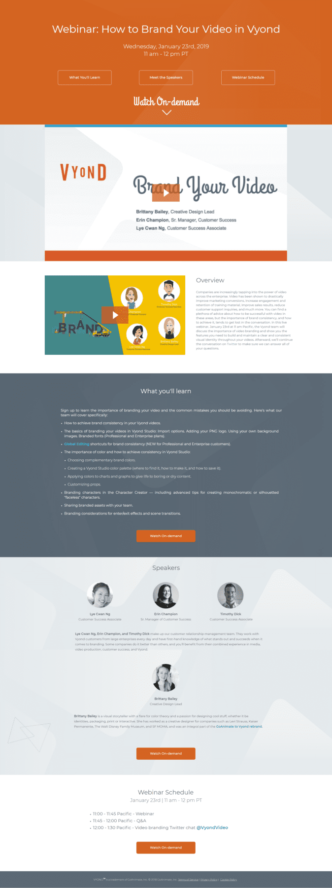
You'll find eight webinar landing page templates to encourage you to make your own.
Each landing page will have a list of its 3 highest-converting features and one thing it's missing.
Consider these when designing your landing page.
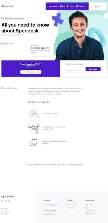
CXL

High Conversion Features
1. Each bullet points in the body uses an active voice to tell users about his webinar. It's simple to see and understand the reasons why you should sign up for this webinar.
2. CTAs They offer the incentive called "Get Unlimited Acces" in order to get users to sign up for his webinars.
Another call to action is added at the bottom of the page along with a sign-up sheet, AND a CTA is used to promote their Facebook page.
In total, CXL placed 3 CTAs in high-converting areas – the top, the bottom, and under the "Have any questions?" section.
3. Visuals CXL’s brand colors are prominent without being distracting. A black and white headshot draws the attention to his features.
CXL does not have all of the necessary features to make a webinar landingpage, however they can use social proof for new clients.
CXL may be the only social proof for marketers.
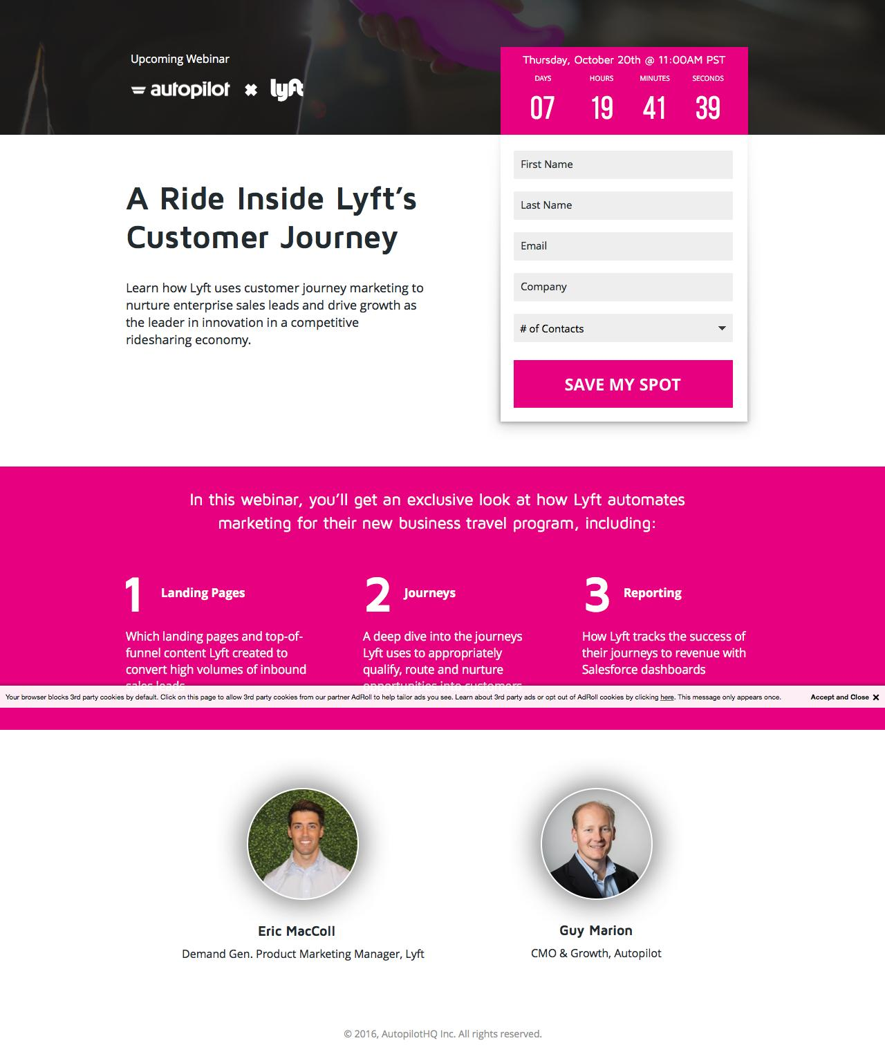
High-Converting Features
1. Speakers Each speaker's headshot is displayed clearly at the top, and they stand out from the dark background.
Note how their names were linked to the bio of themselves. This avoids a lot of text and keeps their page clean.
2. 1.Registration. The registration form is easy. Users won't feel violated with this sign-up form, especially with the option to opt-out of selling their personal info.
3. Details of your event You will be able to select the time zone you prefer at the top of this page. People from different time zones can attend your webinar, thus expanding your potential audience.
What's the problem? Although the webinar landing page has all the necessary features, it could use more CTAs than the usual "Register Now" button.
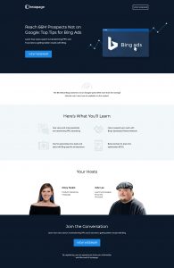
Well-being. You can check 360

Features with high-converting features
1. This landing page features social media icons.
You can click an icon to be directed to another social media page.
For example, if you click on the Twitter icon, you'll be directed to Twitter with an already-made Tweet.
Organic advertising is when users share the news on social media. You don't even have to pay a cent.
2. Things you'll learn This section states exactly what users will get out of their webinar. The bullet points make it easy to read and understand.
3. Layout. It is easy to navigate their webinar landing pages without becoming distracted. It helps to concentrate on their content.
But it is missing something: the headshots of speakers aren’t clear. Each photo should be bigger and easier to see.